Opentrons Ebook
Translating biotechnology and automation into clear, compelling editorial design. Created in collaboration with the Superside editorial and design teams.
00

problem
Opentrons, the lab automation leader, required a digital book aimed at startup founders and biotech innovators that would be able to translate both complex scientific ideas into an accessible visual language with momentum. The following discussion on content explained how automation allowed early-stage biotechs to scale, from funding and reproducibility through to the future of scientific discovery in what they refer to as “The Century of Biology.” The challenge was to design an experience which could communicate technical credibility without visual heaviness. It needed to sound modern, aspirational, and be readable to both scientific and business audiences, all while staying true to Opentrons' established brand identity.
solution
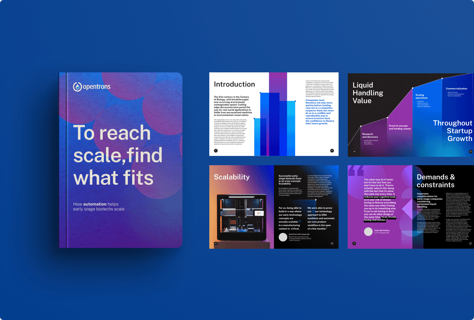
Working within Superside's collaborative model, our team developed an editorial approach that blended data, storytelling, and abstraction. I worked in Figma to explore new ways of applying Opentrons’ visual identity, while keeping typography, spacing, and tone consistent across the piece. The design used creative gradients from the brand’s core palette and abstract graphics to represent automation. Instead of relying on animation, motion was suggested through layout and visual rhythm. The result was a structured but fluid eBook that helped elevate Opentrons’ communication strategy. It framed automation not as machinery, but as a concept rooted in rhythm and scalability. This visual direction later influenced other brand campaigns and set a new design standard.
Designing the Language of Science for Humans
Science moves fast, but design has to move faster to keep up with it.
This project required the translation of highly technical information to provide visuals that breathe, simplify, and engage.
Working hand in hand with copywriters, brand strategists, and designers located throughout different time zones, our goal was to make automation feel human.
The visual rhythm mirrored the science it described: layered, modular, and in constant evolution.
It was an exercise in restraint: communicating intelligence without complexity, clarity without oversimplification.
In the end, the eBook wasn't just about telling the story of automation but became an example of it: efficient, precise, and reproducible.
Editorial design · Layout and visual concept development in Figma · Brand exploration within guidelines · Cross-team creative collaboration
01

02

03

04

see also


